Deploy Logistics Operational Dashboards using DataPane
Deploy Reporting Solutions using DataPane to Support Warehousing Logistics Operations for E-Commerce.
Build reporting capabilities to provide supply chain visibility and support the operational teams of a Distribution Center of a mid-size retailer.
In some markets like China, the retail industry has been completely disrupted by E-Commerce.
Rapidly changing consumer behaviours have dramatically altered how these companies manage their business.
This directly impacts the Logistics Operations of medium-sized retailers, which now face high volume volatility, larger product portfolios, and very short lead times.
How can we help them with descriptive analytics?
They may not have the budget to invest in expensive data infrastructures to build reporting capabilities.
In this article, we will design a simple architecture to deploy an interactive dashboard for Warehousing Operations using the Python Library DataPane.
💌 New articles straight to your inbox for free: Newsletter
I. Context: Warehousing Operations for E-Commerce
Warehouse to prepare and ship orders for an E-Commerce website
ObjectiveHow can you support Operational Excellence with simple reports
II. Build reports using DataPane
1. Quick IntroductionDeploy and share your results with Datapane
2. Monitor the picking workload
Build visuals showing the number of orders received per day
3. Analyze the volumes pareto
How many SKU are representing 80% of your volume?
III. Conclusion & Next Steps
Scenario
Problem Statement
As a Continuous Improvement Engineer in the Distribution Centre (Warehouse) of a mid-size online retailer, you are in charge of building reporting capabilities to bring visibility to operational teams.
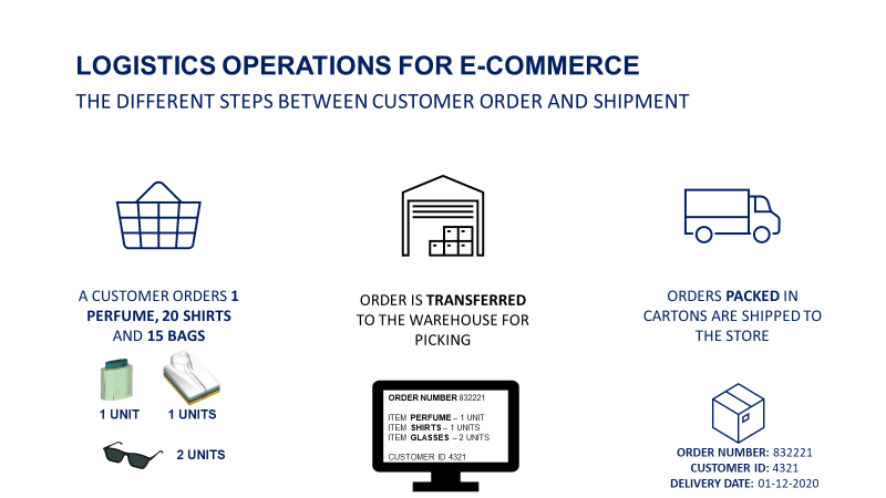
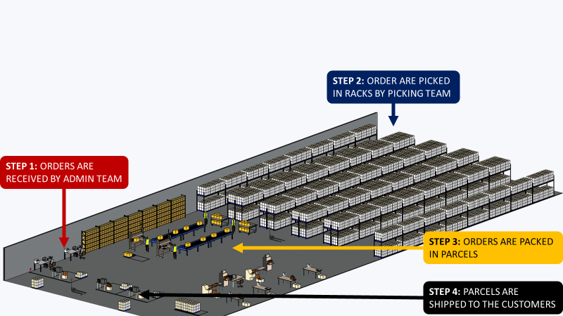
The distribution centre is in charge of order fulfilment and shipment
- Customers order products on the website
- These orders are received by the Warehouse Management System (WMS)
- Warehouse Operators prepare the orders and pack them in parcels
- Parcels are shipped to the customers
The most important Key Indicator of Performance (KPI) is the lead time from order receipt to parcel shipment.
This indicator is impacted by all the processes in the chain.
You will provide visibility into the key indicators that impact overall performance.
Build reports using DataPane
You will not build a complete cloud architecture with ETL jobs and advanced visualization tools like PowerBI, Tableau or Google Studio.
The idea is to extract data from the WMS, process it locally, and deploy reports for operational teams to use.
Deploy reporting capabilities with DataPane
This framework lets you share the results of your Jupyter notebook with your colleagues.
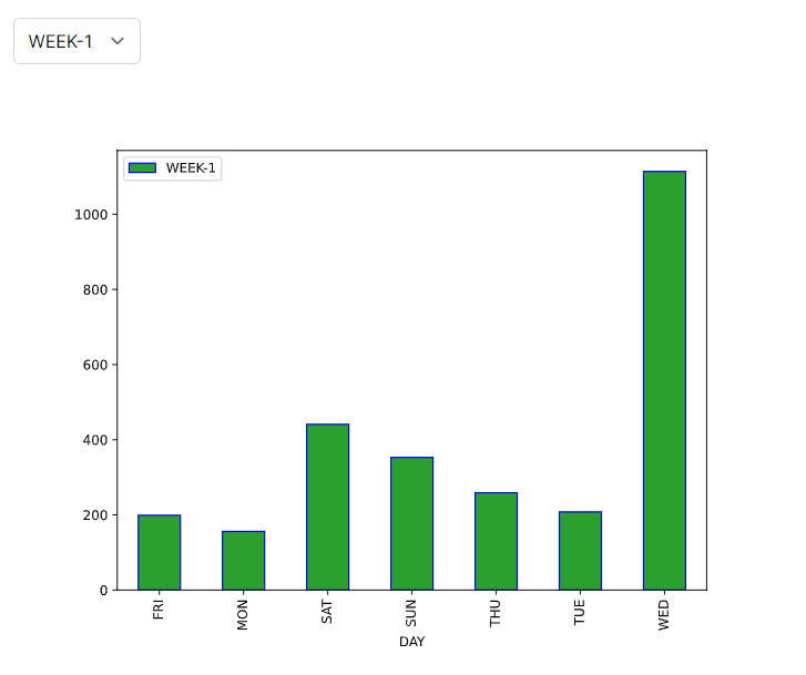
For instance, you would like to share this simple bar plot.
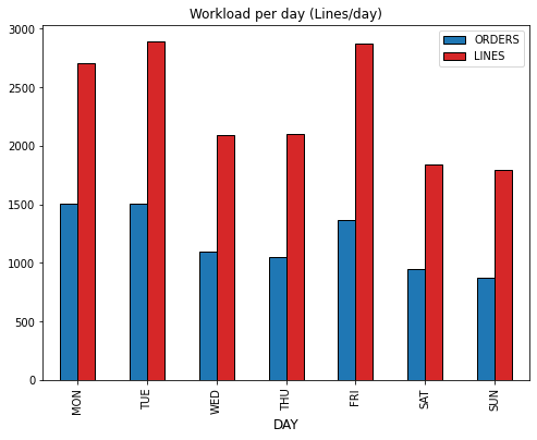
This chart shows the number of orders (and lines) received by the warehouse per day.
How can you share this graph with your colleagues?
. You
It is a very simple process in three steps, with more details in this Link
- Get the client library using pip
2. Sign up on DataPane and register your Token
3. Deploy your visual
You need to add a section in your code to deploy your visual.
You can choose several templates
4. You can share this visual with colleagues
They can even select the week with the button (top-left). This visual can be shared privately with a link that you can send to the operational teams.
Next Steps
We will now build a set of visuals, based on specific processes, to bring visibility to the teams.
Monitor your workload
Focus on the Picking Process
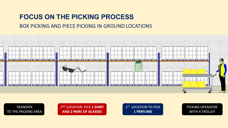
Operators are taking their trolleys with a customer-ordered list and will stop at each location to pick up the specified quantity.
If you want to understand more about the picking process, have a look at the video below
Number of Orders/Lines
Question
How many orders (and lines) do we receive from customers every day?
A major indicator of the picking workload is the number of customer orders (and order lines).
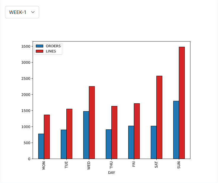
Insights
Week-1 Sunday: picking teams faced a peak day.
Number of Pieces per Day
Question
How many items are ordered by customers every day?
This indicator provides visibility into the company's turnover for that day.
It is also affecting the volume (in cubic meters) of parcels shipped.
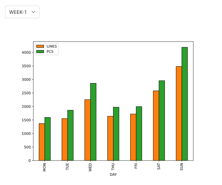
Insights
Week-1 Wednesday: we experienced a surge in the number of pieces per line due to a special promotion for a certain item.
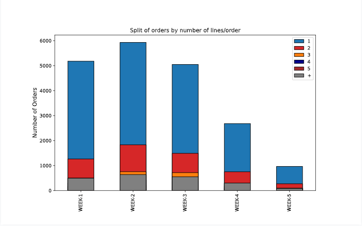
Split of orders per the ratio of line/order
Question
What is the split (%) of mono-line orders for each day?
With a high number of lines per order, your operators will see their walking distance per order increasing.
Therefore, their picking productivity is directly affected by the number of lines per order.
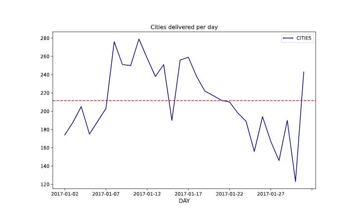
Number of Cities Delivered
Question
How many different cities do I need to deliver per day?
The number of cities delivered impacts your workload for transportation management.

Insights
We have a majority of mono-line orders (1 line/order) that can be picked by batch.
Focus on the replenishment process
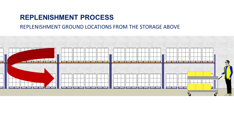
When the picking locations (on the ground) are empty, your forklift drivers perform replenishment tasks.
They take items from the storage area above to replenish the picking locations for future orders.
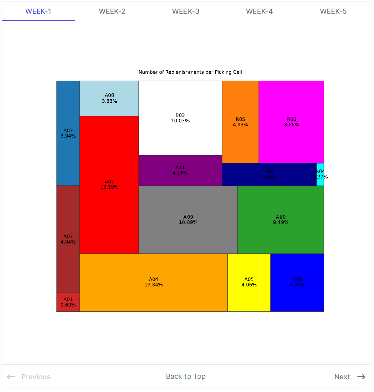
Number of replenishments per day
How many replenishment tasks are performed by your operators per day?
This process can become a bottleneck and impact your overall performance.
Therefore, you need to track your daily workload.
Insights
For a large part of the month, you experienced a surge of the number of cities delivered that may impact your transportation costs.
Number of replenishments per alley
Question
Which area of your warehouse concentrates the majority of your volume?
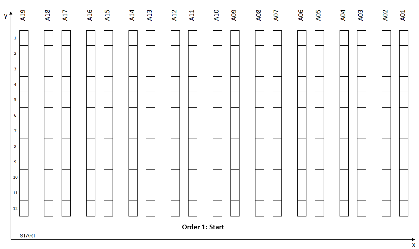
Your warehouse is organised by alleys with cells and picking locations.
A major bottleneck occurs when a concentration of people is in one area.
If you encounter this issue, the best solution is to avoid grouping high-rotation areas together.
Insights
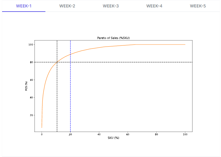
20% of the volumes in Pieces
Analyse the Pareto
Question
How many SKUs are representing 80% of my total volume?
To optimise your processes, you need to perform product segmentation based on the volume per item.
High rotations items need to be put in full pallet picking location while low rotations can be stored on shelves to save space.
As the business evolves, you need to track your Pareto to adjust your layout and processes.
If you want to understand more about the Pareto law for layout optimisation, have a look at the video below
Conclusion
You have built a set of simple yet highly useful visuals that operational teams can use.
For instance, they can be embedded in a Notion document with a comments area to make it a living document.
This solution will not meet the performance and functionalities of a proper cloud architecture.
However, it can be easily implemented at no additional cost for small structures.
You can deploy the code you use to build these visuals to the cloud (Heroku, Google App Engine) to automate the process and trigger tasks daily.
About Me
Let’s connect on Linkedin and Twitter. I am a Supply Chain Engineer who is using data analytics to improve logistics operations and reduce costs.
If you’re looking for tailored consulting solutions to optimise your supply chain and meet sustainability goals, feel free to contact me.