Automate PowerPoint Slides Creation with Python
Boost your Productivity with an Automated Tool for the Creation of Supply Chain Operational PowerPoint Reports with Python.
You are a distribution planning manager in the logistics department of a fashion retail company.
To perform analysis, you connect to the warehouse management system to extract and process data using an automated Python tool.
However, you have to manually add these visuals to slides for your weekly operational reviews.
Objective
In this article, we will build a solution to automatically create PowerPoint slides with visuals and comments.
💌 New articles straight to your inbox for free: Newsletter
Have a look at the video version of this article,
Problem Statement
Scenario
You are part of the distribution planning team of an international clothing retailer with stores on all continents.
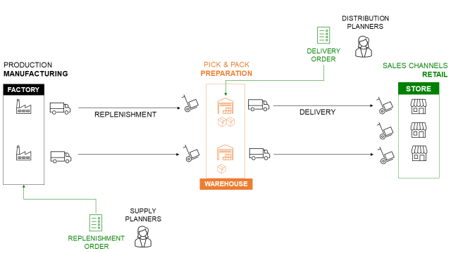
Your distribution network includes several local warehouses that replenish the stores.
Monthly Operational Reviews
At the end of the month, you organise an operational review with the store managers to assess the performance of the distribution network.
To animate the discussion, you prepare some slides,
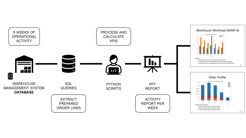
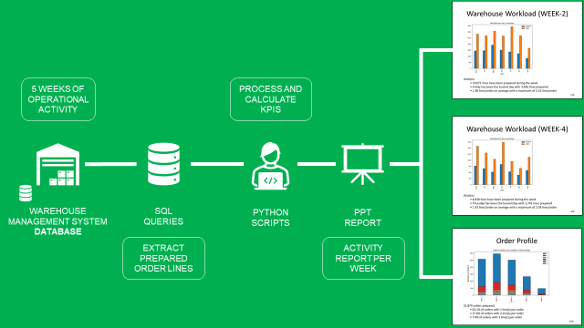
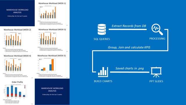
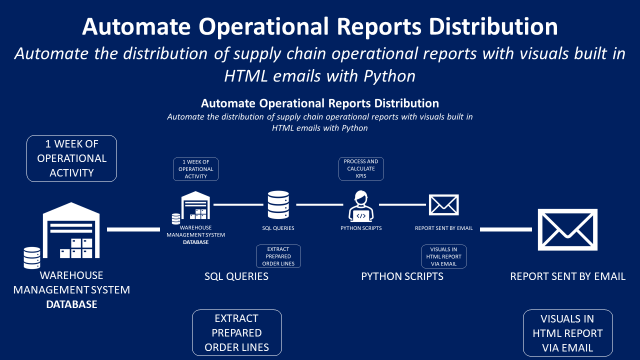
- Extract data from the Warehouse Management System (WMS)
- Process data and build visuals with Python
- Prepare a PowerPoint presentation
Objective
To be efficient, you would like to automate the creation of PowerPoint decks.
Your solution will be fully automated
- Extract order lines of the last month from the WMS SQL database
- Process the data and compute KPIs with key insights by week
- Automatically put the visuals and insights in a PowerPoint presentation
Results
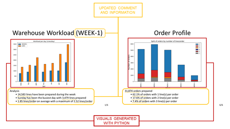
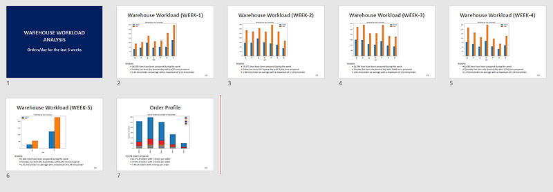
The final deck will have slides like the ones below:
- 5 slides with visuals of the daily workload (left) and 1 slide for the monthly analysis of the order profile (right)
- A visual generated with Python
- A comment area will provide insights based on the visual
Solutions
Let us explore all the steps to generate your final report with Python.
Data Extraction
Connect to your WMS and extract shipment records
- Create your SQL Query to extract shipment records
- Use
pandas.read_sql_queryTo add it to to do the query - Results will be a pandas data frame
If you don’t have access to a WMS database, you can use the dataset shared in the GitHub repo.
Process the data
Add a column that calculates the number of lines per order using pandas.
Create the visuals
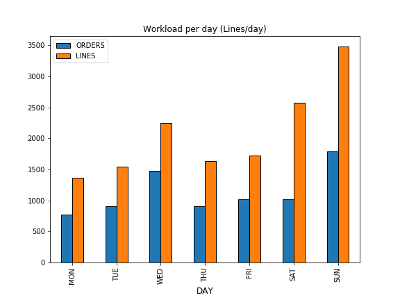
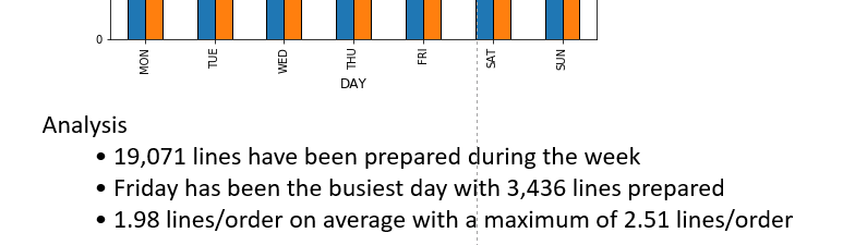
Create a simple bar plot chart that shows the number of Lines and Orders prepared per day.
Save the charts
To add it to PowerPoint, you need to save it locally.
Add comments and insights.
You can add comments based on the chart you share that will summarise the performance of each week.
Include these comments under the visuals for more clarity.
Create the PowerPoint Decks
We will use the open-source library python-pptx to build our PowerPoint decks.
Introduction Slide
We will start with a special introduction slide at the beginning of the presentation.
Code
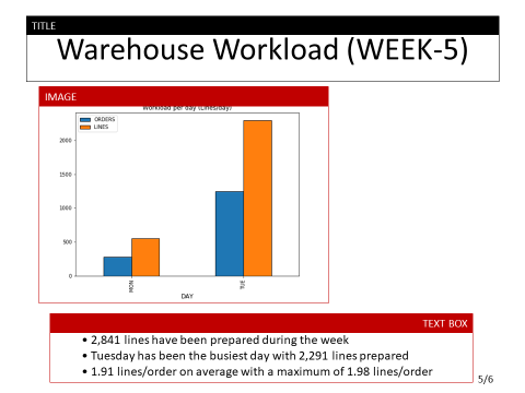
Daily Analysis Slide by WEEK
The structure of your slide will always be the same
- A title on top (e.g, Warehouse Workload (WEEK-5))
- A picture at the centre of the slide
- A text box for the comment area
Code
💡 TIPS
You can change the position of the objects by modifying the parameters of the Inches() functions.
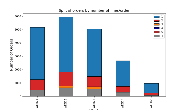
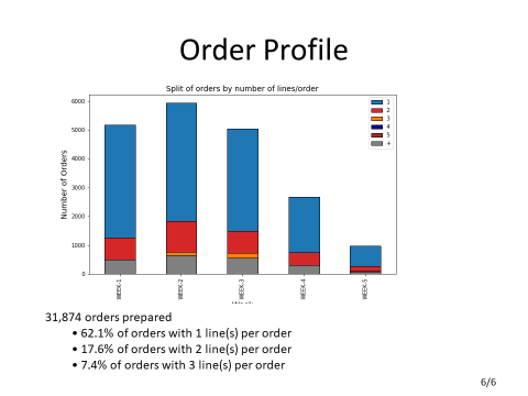
Weekly Analysis of Order Profile
In this slide, you will use a stacked bar plot chart, and the comments will be based on the whole month scope.
Code
💡 TIPS
You can change the font size by modifying the parameter of the functions Pt().
Finally, you have a PowerPoint file with 7 slides ready for your meetings.
Conclusion
With this simple example, you have a template for building your own PowerPoint automation solution.
You can now,
- Add visuals, tables or bright visuals of PowerPoint (check the documentation)
- Bring more insights or enrich the text with conditions
This Python script can be run locally on your computer with a single click.
You can also automate the report distribution by email using the SMTP library of Python.
For more details, you can have a look at this article I published a few weeks ago.
About Me
Let’s connect on LinkedIn and Twitter. I am a Supply Chain Engineer who is using data analytics to improve logistics operations and reduce costs.
If you’re looking for tailored consulting solutions to optimise your supply chain and meet sustainability goals, please contact me.