4 Smart Visualizations for Supply Chain Descriptive Analytics
Use Python to build visualizations that will provide visibility on key Supply Chain Metrics
Supply chain Analytics can be defined as a set of tools and techniques your organisation should use to get supply-chain operational insights from data.
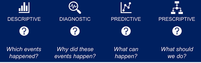
In a previous article, I defined the four types of Supply Chain Analytics that address different operational questions.
It starts by building the foundation of Descriptive Analytics to monitor the present and analyse the past.
In this article, I will share four Python smart visualisations for Descriptive Analytics that provide key insights to understand your Supply Chain.
💌 New articles straight to your inbox for free: Newsletter
If you prefer watching, check my YouTube tutorial!
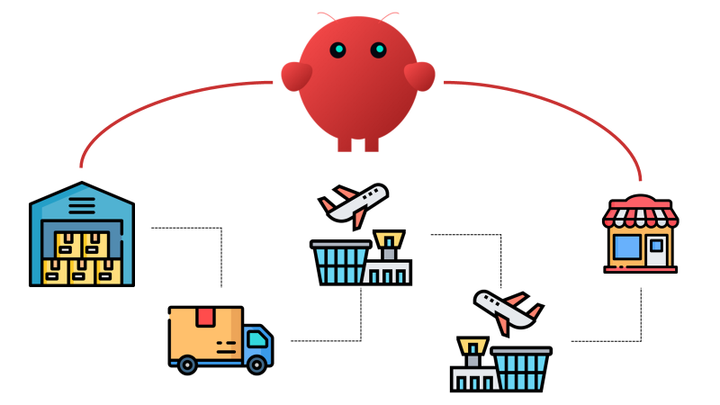
Supply Chain Network
A Supply Chain can be defined as a network of processes and stock locations designed to deliver goods and services to customers.
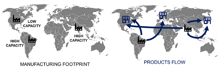
The main drivers of your network optimization are the locations of your manufacturing sites and the optimization of the flows.
Supply Chain Flows
Which factory is producing for Market XYZ?
You want to understand the efficiency of your network by drawing the flows between production areas and markets.
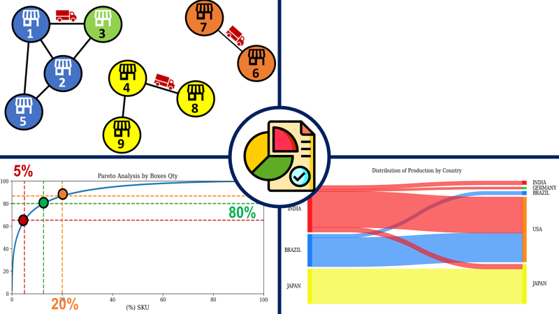
Sankey Chart
In this single chart, you can see all the different flows.
On the left, you have the production facilities; on the right, the markets.

- India is the biggest country for production output
- Japan market demand is mainly supplied locally
- USA and Germany do not have local production facilities
📈 DATA
You need to prepare a DataFrame with three columns:
- Source: the production facility name
- Target: the market supplied
- Units: the number of items flowing
📚 LIBRARY
You can use pySankey
For more details, see the source code in my GitHub repository.
Network Design
Supply chain Network Optimisation leverages data analytics to identify the optimal combination of factories and distribution centres to produce and deliver products at the lowest cost.
Which factories should I open to get an optimal network?
If your demand is unstable, you can run simulations for different scenarios and ask your model (based on linear programming) to provide the best solution for each of them.
A solution is basically a set of boolean decision variables listing all potential locations: their value is one if you open the location 0 else.
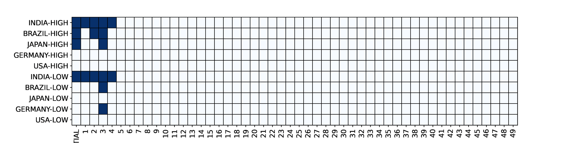
Boolean Plot
In this chart, you have visibility on the results of 50 different scenarios:
- x-axis: the name of the scenario
- y-axis: the decision variable linked to a facility (dark blue: open, white: closed)
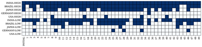
- Initial solution with (Indian, Brazil and Japan High + India Low) is repeated in more than 5 five scenarios
- Some extreme scenarios need only two factories in India
📈 DATA
You need to prepare a DataFrame with the output of your optimization model (vectors with boolean parameters).
📚 LIBRARY
You can use matplotlib.pyplot.pcolor
These visuals are strategic for the network design methodology that is detailed in the tutorial linked below.
Products Rotation
In Supply Chain Management, Product segmentation refers to grouping products with similar characteristics.
Pareto Chart
It is important to classify your products to allocate your inventory management efforts, optimise your warehouse operations, or design your racking layout.
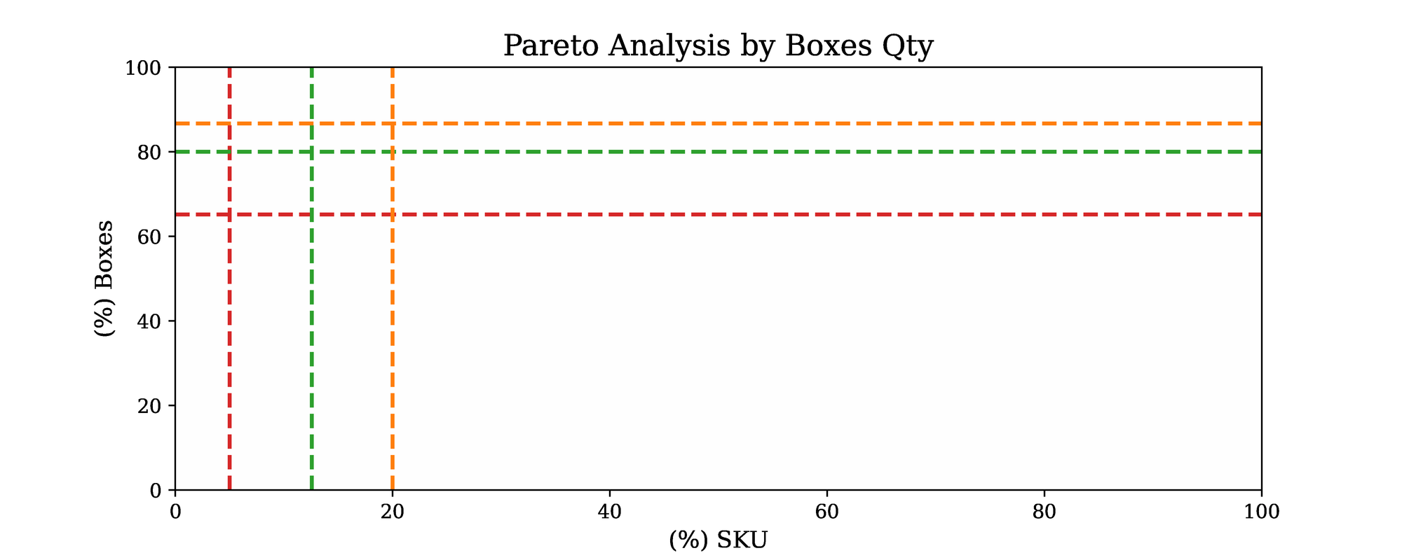
How many references make 80% of my total turnover?
The foundation of this approach is the Pareto principle, also called the 80–20 rule.
Most of the time, a minority of your products (usually around 20%) accounts for the majority of your outbound volume (usually around 80%).
Pareto Chart
This plot can show you where your product rotations are compared to the Pareto law:
- x-axis: the percentage of reference of your portfolio (%SKU)
- y-axis: the percentage of the outbound volumes they represent (%Boxes)
In this example, you can quickly see that you have less than 20% of your total portfolio contributing to 80% of the outbound volume.
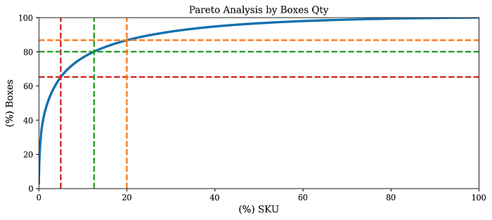
- Very high rotations (top 5%) make more than 60% of the volume
- 20% of the portofolio represent 84% of the outbound volume
📈 DATA
You need to prepare a DataFrame with the outbound volume of each SKU, their contribution in the total volume and then calculate a cumulative sum.📚 LIBRARY
You can use matplotlib.pyplot for a simple plot.
For this one, I have a complete end-to-end tutorial.
Logistics Performance
The performance of your distribution network can be summarised in one sentence
Are you delivering your end customers on time in full?
This is the central question animating performance management with analytics, operational review and continuous improvement initiatives.
Shipment Tracking
Supply Chain Descriptive Analytics uses data generated by the systems across your distribution chain to track the timestamp of each step your shipment undergoes.
At a tactical level, you have distribution planning teams that monitor the status of recently created orders.
Where are my shipments?
From the order creation to the store delivery, your shipment goes through different steps:
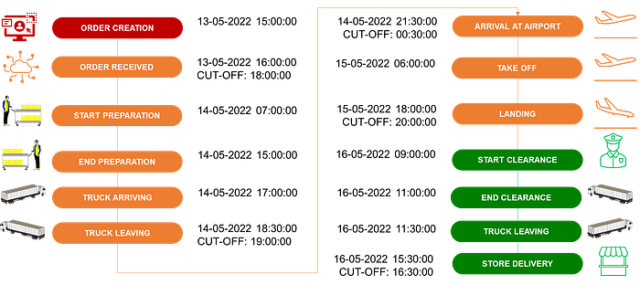
For each step, your systems record timestamps at the beginning and end of the process.
Stacked Bar Plot
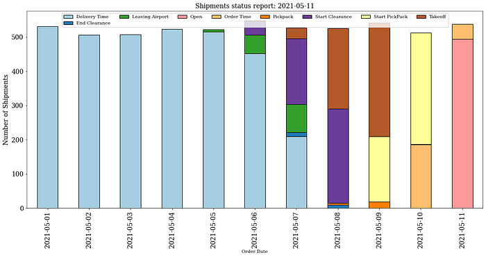
At a time t, this chart shows the split of shipments by current status:
- x-axis: orders are grouped by order creation date
- y-axis: number of shipments
- Legend: the current status of your shipment from order creation to store delivery
- 100% of the orders created before 05th May are delivered- A majority of the shipments created the 8th are blocked in the clearance
📈 DATA
You need to prepare a DataFrame by grouping orders by creation date and current status and count them.
📚 LIBRARY
You can use matplotlib.pyplot for a bar plot selecting stacked=true
For more details, see the source code in my GitHub repository.
Conclusion
These straightforward charts can provide extremely valuable insights for supply chain design, optimisation, and monitoring.
About Me
Let’s connect on LinkedIn and Twitter. I am a Supply Chain Engineer who is using data analytics to improve logistics operations and reduce costs.
If you’re looking for tailored consulting solutions to optimise your supply chain and meet sustainability goals, feel free to contact me.