Transportation Network Analysis with Graph Theory
Use graph theory to optimize the road transportation network of a retail company
For a retailer, road transportation to deliver to stores represents a significant part of the logistics costs.
Companies often conduct route planning optimization studies to reduce these costs and improve the efficiency of their network.
It requires collaboration between continuous improvement engineers and the transportation teams that manage operations daily.
In this article, we will use Graph Theory to design visual representations of a transportation network to support this collaboration and facilitate solution design.
💌 New articles straight in your inbox for free: Newsletter
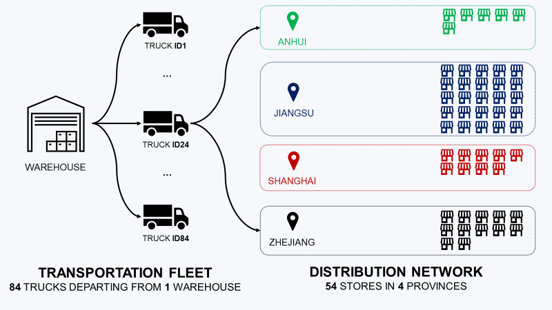
I. Distribution Network
Distribution centre of a retail company with 54 stores
II. Problem Statement
Optimization of the route planning to reduce transportation costs
1. Exploratory Data Analysis
1 year of deliveries to 50 stores
2. Multi-Store Delivery
Use dedicated trucks to deliver several stores
III. Solution using Graph Visualization
1. Visualization using the Graph Theory
What are the stores that are delivered together?
2. Challenge the current routing
Collaborate with the Transportation Planner to expand the routes
IV. Conclusion & Next Steps
If you prefer watching, have a look at the Youtube tutorial
Distribution Network
Context
As a continuous improvement engineer of a retail company, you are in charge of reengineering warehousing and transportation operations.
In your scope, you have a major distribution centre located in Shanghai (China) that delivers 54 hypermarkets.
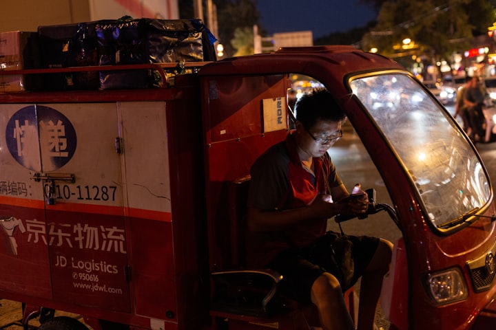
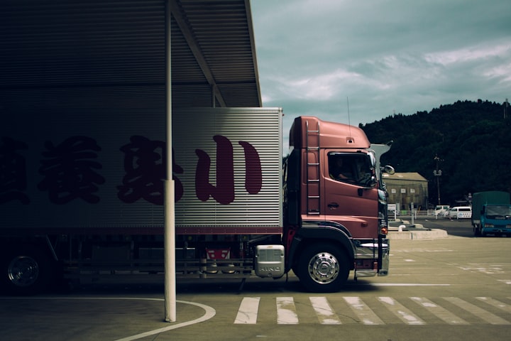
Delivery by Truck
These stores, located in four different provinces, are delivered using 3rd party transportation service providers.
They provide trucks with three different capacities (3.5 Tons, 5 Tons, 8 Tons).
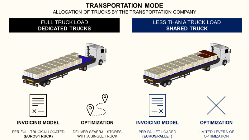
Based on the routing and loading plans designed by the transportation planners, a dedicated truck is allocated to deliver stores.
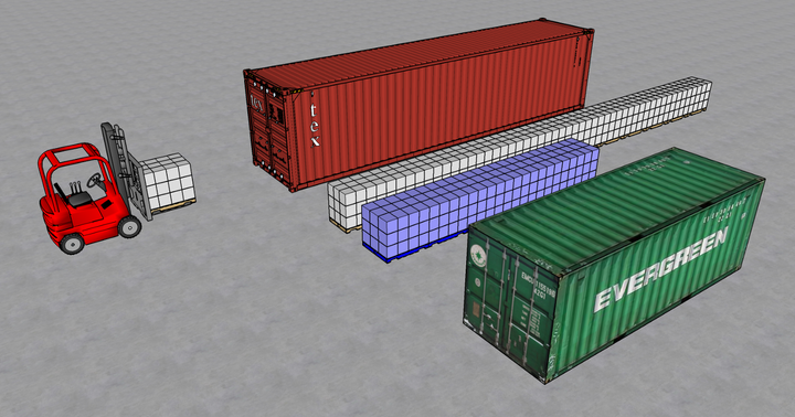
Loading Plan Example
Let’s imagine a scenario with three stores in Shanghai that ordered a total of 30 pallets (5 T).
- The transport planner decides to deliver these three stores with a single 5T truck
- Pallets are loaded into the truck
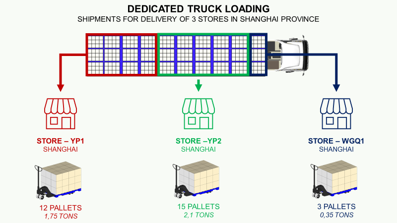
You are invoiced by the carrier using a price per truck (Rmb/Truck) based on the first city delivered on single store routes as possible the route.
For the delivery of these three stores in Shanghai
Cost = 650 (Rmb)
The role of your transportation planning team is to design routes to ensure that your trucks are full when they leave the warehouse.

Therefore, they avoid as many single-store routes as possible to maximise the filling rate.
If you want to know more about the FTL Transportation
Problem Statement
Objective
Your objective is to reduce the total cost of transportation.
Insights: Cost per Ton
A major lever of optimization is the size of trucks.

If you increase the average truck size, you reduce the overall cost per ton. A good method is to deliver more stores per route.
Exploratory Data Analysis
You have 12 months of shipments to understand the current routing.
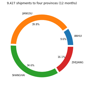
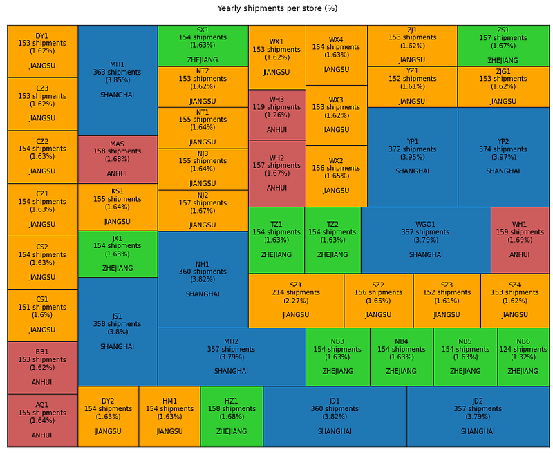
Number of shipments per store
A majority of the deliveries are in Shanghai and the neighbouring province of Jiangsu.
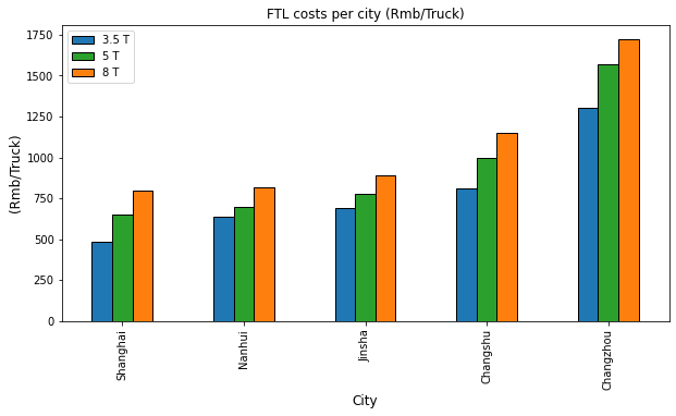
Trucks size
Except in Shanghai, where you have large hypermarkets driving a large part of the demand, the other provinces have stores of relatively the same size.
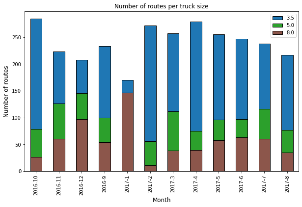
Number of routes per truck size
Except in January, the peak season before the Chinese New Year, the majority of routes are delivered using small trucks.
Solution using Graph Visualisation
The objective is to design a new transportation plan to increase the average size of trucks by delivering more stores per route.
Constraints
Because of operational limitations, you need to respect the constraints below
- Delivery Time Window: stores can receive products only at a certain time of the day
- Road Restrictions: large trucks are forbidden on some roads
- Unloading Conditions: some stores need to be delivered first
Visual Support for Collaboration
Because of these operational constraints, you cannot perform this analysis alone.
It is key to collaborate with the transportation teams that have experience managing the route planning daily.
Solution: Graph Theory
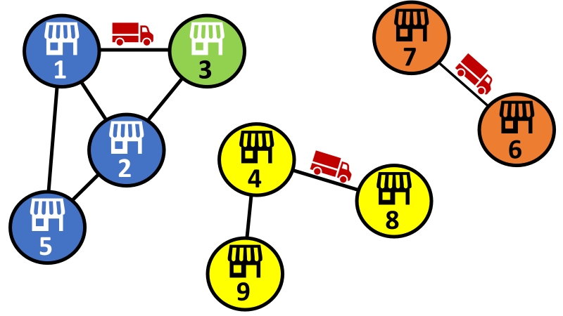
A graph is a structure that contains nodes (stores), and each of the related pairs of nodes is called an edge.

An edge of two stores means that these stores have been delivered together at least one time.
For instance, store 2 has been delivered with store 3, store 5 and store 1.
Question
With the current routing, which stores are delivered together?
Challenge the current routing
Let’s have a look at the results with the current routing.
Example: Full-year scope
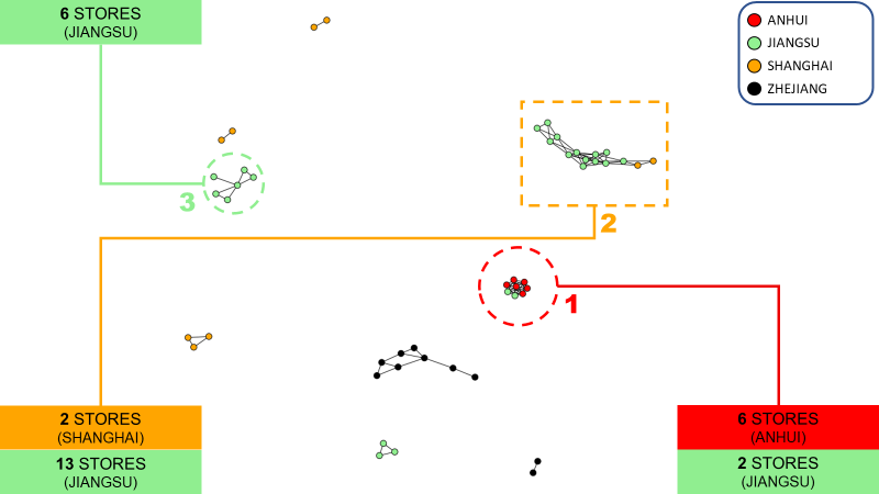
You can find different types of clusters
- Type 1: stores are all interconnected and usually represent a single route (it is good to group several stores in one route)
- Type 2: stores are sequentially connected, creating a chain
- Type 3: 1 store is connected to all the other stores
This visual can support discussions with the transportation team
- Why do we have two isolated stores in Zhejiang?
- Can we increase the average truck size if we group the two isolated pairs of Shanghai?
- Can we have more type 1 clusters?
Question
What is the impact of truck size?
Example: 3.5 T trucks only
Our main issue is the high proportion of small trucks in our fleet.
Network Graph of 3.5T trucks

There are fewer interconnections for these routes. There are no major clusters of interconnected nodes.
Average Truck Size
The observation is confirmed when you look at the average number of deliveries per route for each truck size.
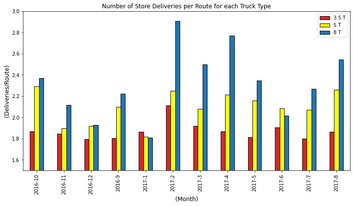
Except during the Chinese New Year peak period, large trucks have a higher number of deliveries per route.
Question
What is the difference between the lowest vs. highest ratio of stores per route?
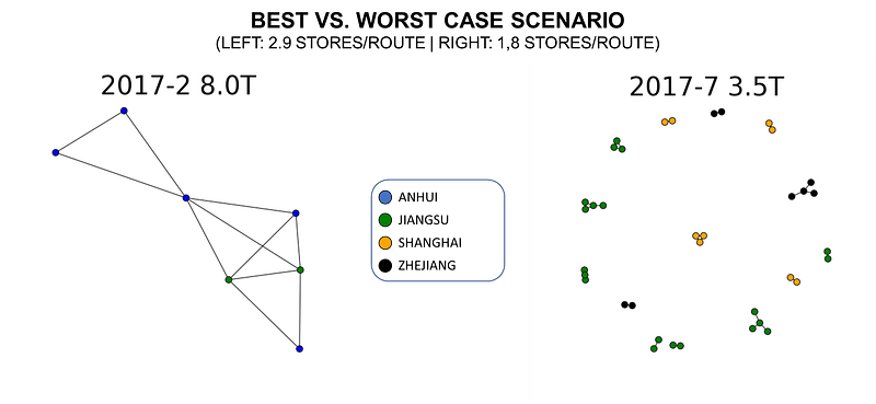
For the best scenario (left), stores are highly interconnected (up to 4 connections).
The contrast is clear with the other network, which is highly fragmented.
Conclusion
This tool provides a visual representation of the distribution network to support collaborative work between you and the transportation teams.
Based on your analysis, you can propose potential improvements (grouping additional stores, merging routes) and assess the operational feasibility with teams.
This analysis is the beginning of the study.
Each of the potential solutions needs to be validated by operations and store managers to ensure a smooth implementation.
About Me
Let’s connect on LinkedIn and Twitter, I am a Supply Chain Engineer that is using data analytics to improve logistics operations and reduce costs.
If you’re looking for tailored consulting solutions to optimize your supply chain and meet sustainability goals, feel free to contact me.