Road Transportation Network Visualization
Build Visualizations of your FTL Network Performance: deliveries/route, cost per ton and trucks size
Following the series of Warehousing Operations Optimization, we will use the same methodology for improving Road Transportation efficiency by
- Processing Data: extract unstructured transportation records and process them to build your optimization model
- Improving Visibility: using Python visualization libraries to get clarity on current routing and truck loading rate
- Simulating Scenarios: build a model to simulate multiple routing scenarios and estimate the impact on average cost per ton
💌 New articles straight in your inbox for free: Newsletter
Problem Statement
Problem Statement
Retail Stores Distribution with Full Truck Load (FTL)
- 1 Warehouse delivering stores by using three types of Trucks
(3.5T, 5T, 8T) - 49 Stores delivered
- 12 Months of Historical Data with 10,000 Deliveries
- 7 days a week of Operations
- 23 Cities
- 84 Trucks in your fleet
Objective: Reduce the Cost per Ton
Method: Shipment Consolidation
In this scenario, you are using 3rd party carriers that charge full trucks per destination:
The table above shows rates applied by carriers for each city delivered for each type of truck.
Observing costs per ton are lower for larger trucks, one improvement lever is maximising shipment consolidation when building routes.
Thus, the Route Transportation Planning Optimization's main target will be to cover a maximum number of stores per route.
Data Processing: Understand the Current Situation
Import Datasets
Before thinking about the optimisation model, your priority is understanding the current situation.
Starting with unstructured data coming from several sources, we’ll need to build a set of data frames to model our network and provide visibility on loading rate and list of stores delivered for each route.
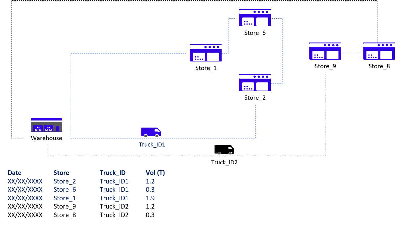
Records of Deliveries per Store
Store Address
Transportation Costs
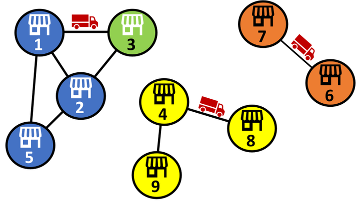
Listing of stores delivered by each route
Let us process the initial data frame to list all stores delivered for each route.
1 Route = 1 Truck ID + 1 Date
Add cities covered by each route
Let us now calculate Transportation Costs invoiced by carriers for each route:
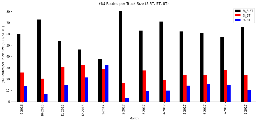
Visualization: % Deliveries per Truck Size
Insights
- Average Truck Size: a large majority of small trucks
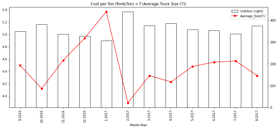
- Cost per ton: the inverse proportion of cost per ton and average truck size
Understand Current Situation: Visualisation
Transportation Plan Visualisation
Objective: Get a simple visualisation of all deliveries per day with a focus on the number of different routes

Solution: Python’s Matplotlib grid function
- Columns: 1 Column = 1 Store
- Rows: 1 Row = 1 Day
- Colour = White: 0 delivery
- Colors: 1 Color = 1 Route (1 Truck)
Visual Insights
- Delivery Frequency: n deliveries per week
- Number of Routes: How many different colours do you have a day?
- Color = White: no delivery
- Routes: do we have the same stores grouped from one day to another?
12 Months Overview
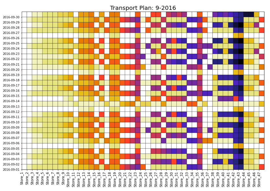
After optimization, this chart will help us to visualize the impact of new routing.
A better routing means fewer routes per day so you’ll have fewer colours per line.
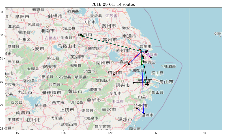
Geographical Visualization of Store Deliveries
Objective
Visualisation of geographical locations delivered in the same route
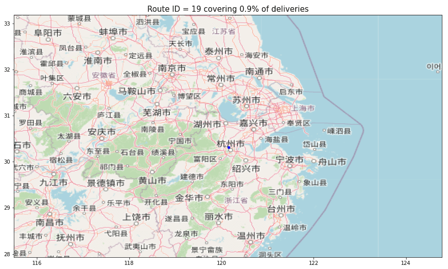
Solution
OpenStreet Map + Matplotlib Scatter Plot
To get this visualisation, you can use the free tool OpenStreetMap. A detailed explanation can be found in this great article (Easy Steps To Plot Geographic Data on a Map, Link) written by Ahmed Qassim.
Visualization of the different routes covered per day

Next Steps
Measure the Environmental Impact
In addition to cost reduction, you can also target CO2 Emissions reductions by optimising your Transportation Network.
Routing Optimisation: Number of Deliveries per Route
- Dataframe with historical records processed
- Current transportation plan
- A model to calculate transportation cost per route based on the cities delivered
- Visualisation of the number of different routes per day
- Visualisation of geographical locations delivered per Route
Next steps are
- Routing: Increase the number of stores delivered for each route
- Fleet Allocation: Ensure uniform workload distribution
- Delivery Frequency: Reduce the number of deliveries per week to increase the quantity per shipment
- Simulate Impact: savings we can get from optimization listed above
About Me
Let’s connect on LinkedIn and Twitter, I am a Supply Chain Engineer that is using data analytics to improve logistics operations and reduce costs.
If you’re looking for tailored consulting solutions to optimize your supply chain and meet sustainability goals, please contact me.