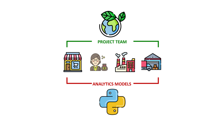
Build Interactive Charts using Flask and D3.js
Design interactive D3.js visualizations for E-Commerce Sales Analytics and Support Business Decisions

The Power of Visualisation
The frustrated genius
You are a proud Data Scientist presenting your new solution designed using optimised code, fancy libraries, advanced linear algebra and complex statistical concepts.
And […]
Your solution got less interest, recognition or enthusiasm from your management than a simple Power BI dashboard presented by a new intern the day before.
Have you faced this frustration?
💌 New articles straight to your inbox for free: Newsletter
You need to develop your skills in visualisation
Simple, fancy visualisations can have more impact than a very complex model, especially for a non-technical audience.
This article will give you a recipe to design them using D3.js without prior knowledge of JavaScript (or very light).
Pre-requisite
- Basic knowledge of HTML
- Intermediate knowledge of Python, including the Flask framework
- Find an example of visualisation you want to design
Get inspiration from the D3.js example
Example: Matrix Diagram of Les Misérables Characters
You are browsing on http://bl.ocks.org/, a great website to get tutorials for D3.js, and you find inspiration.
And you find this visual: a Matrix Diagram by Mike Bostock.
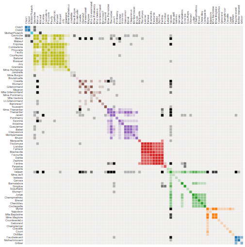
Les Misérables is a famous French historical novel by Victor Hugo published in 1862.
This matrix shows the co-occurrence of characters
- 1 coloured cell = two characters appearing in the same chapter
- dark cells: characters with a high frequency of occurrence
- light cells: characters with a low frequency of occurrence
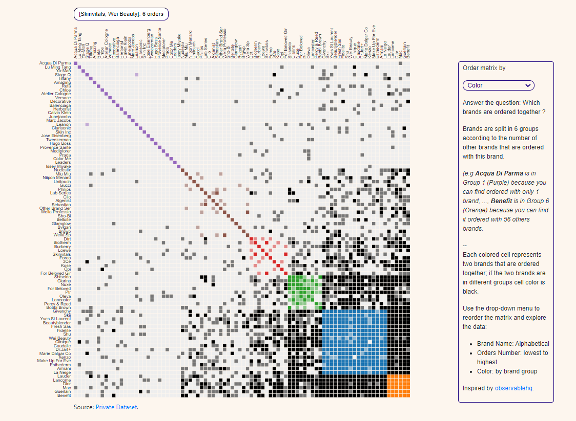
Apply this visualisation to your business case
You have a dataset of Luxury Cosmetics products' online sales at the order line level.
You want to build a matrix showing the Darkco-occurrence of brands
- 1 coloured cell = two brands appearing in the same customer order
- Dark cells: brands that appear with many other brands
- Light cells: brands that appear with few other brands
Build your solution using Flask
Duplicate this example on a template rendered with Flask
Let us start by rendering an example found in b.locks, following the structure below:
app.py
/templates
    index.html
/static
    /data
      miserables.json
    /js
      /Libs
      matrix.js
/css- /templates: index.html is the dashboard page using this code
- /js/libs: JavaScript libraries used to render D3.js
- /js/matrix.js: script used to render your dashboard using miserables.json
- /static/miserables.json: JSON file used by matrix.js to render
- /CSS: CSS files used to render the page
The entire code is available here:
Follow these four steps:
- Clone the repository in your local folder
- Download libraries listed in requirements.txt
- Launch app.py
The visual should look like this.
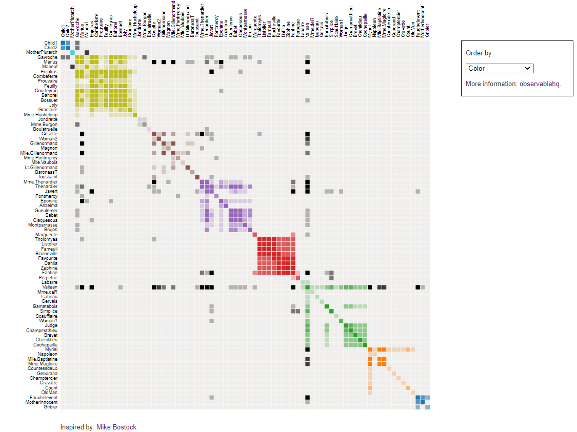
You have now built your first visualisation solution using Flask and D3.js.
Next steps are
- Replace miserables.json with your dataset
- Adapt matrix.js to show brands' co-occurrence
- Adapt the HTML page code to
Processing your raw data set into the final JSON
Start with miserables.json
The first step is to analyse miserables.json
2. Links: Listing pairs of characters "nodes":{"source" : Character Name 1,"target" : Character Name 2,"value" : Number of Co-occurence}
Characters are distributed in different groups called "nodes"
"nodes":{
"name": Character Name,
"group": Group Number
}
Listing pairs of characters
"nodes":{
"source": Character Name 1,
"target": Character Name 2,
"value": Number of Co-occurence
}
Get your brands.json
What do we want?
Nodes: Brands are distributed in groups depending on the number of different brands that are ordered with them:
 "nodes":
{"name": Brand Name,
"group": Group Number
}
Links: Listing pairs of brands with the number of orders they appear together
"nodes":{
"source": Brand Name 1,
"target": Character_name2,
"value": Number of Orders they appear together
}
Build nodes
The first function order_brand will prepare data frames and lists needed for the create_nodes function, which will build your nodes dictionary.
Comments
- n_groups: number of groups brands will be split into
- line 35: descending order
{group 1: brands ordered with many other brands,
group n: brands that appear with few other brands}
Build Links
Export everything in JSON
Final Result
Comments
- json_to: this function will return JSON that will be retrieved by sending a GET request to the page ‘/get-json’
Your JSON is ready for use with matrix.js (after a few adjustments).
Adapt Matrix.js to fit with your brands.json
Add a tooltip to show the brand pair selected on hover
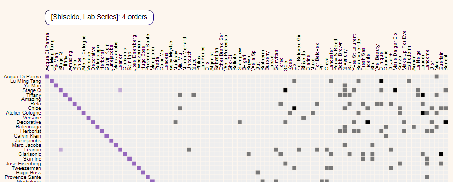
I added these lines to the mouseover function to display the selected brand pair.
Download JSON file
This function will send a GET request to your Flask page /get-json that will return json_to with the create_json function.
Final Touch
Adapt the HTML code to add a caption
Final Rendering
- /CSS: bootstrap and styles.css to improve the rendering of your page
For more details, you can find the entire source code here
Conclusion
You can find a static version of this matrix chart in my portfolio: Matrix Chart
This was an easy process in 4 steps
- Find a good visualisation you want to use for your business case
- Download HTML code, JavaScript, CSS, JSON file and all files needed to build the page
- Render this page locally with Flask
- Analyse JSON format and build functions to adapt your input data
- Adapt JavaScript to fit with your data frame format
- Customise the HTML page to add information regarding your dataset
You do not always need to use D3.js.
There are some interesting libraries, like Plotly, that can do an excellent job too.
For more examples,
About Me
Let’s connect on LinkedIn and Twitter, I am a Supply Chain Engineer theses using data analytics to improve logistics operations and reduce costs.
If you’re looking for tailored consulting solutions to optimise your supply chain and meet sustainability goals, feel free to contact me.